Template details:
Appearances are everything – a guide to making your CV look great
The overall look and layout of your CV is the very first thing that a recruiter sees, and if it isn’t very easy on the eye then you have already lowered their expectations. With literally hundreds and sometimes even thousands of applications being sent for just one job, every single part of your CV has to be absolutely perfect – starting with the appearance.
Here’s our short guide on what to lookout for to ensure your CV stands out from the rest of the competition…
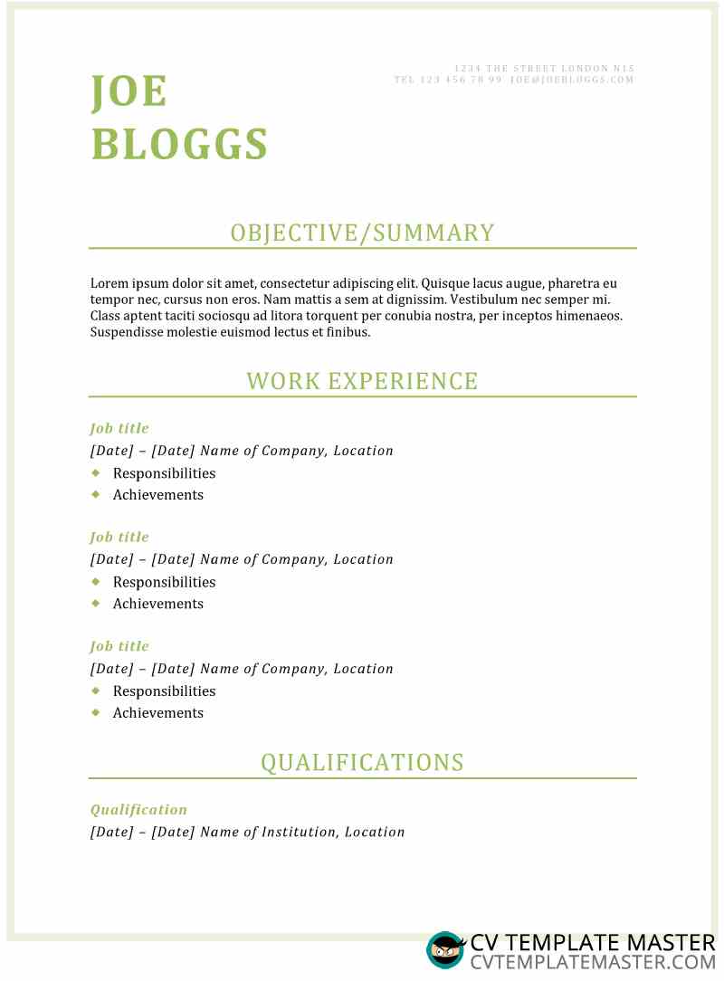
Presentation, structure and appearance
The layout, font size, structure and overall appearance of your CV is the first thing that a recruiter notices – and in most cases they don’t even realise that they are judging it! Every single detail of your CV will be scrutinised the second it’s picked up, and first impressions will make or break your chances.
There are lots of templates to choose from on the internet, but choosing the right one for you depends on many things. Selecting a CV template is a bit like choosing clothes, and everyone has different styles and tastes. Before you make your selection consider the following:
- Is it easy on the eye?
- Does the structure and layout make it easy to follow?
- Have I written too much or too little for each section?
- Is each section in the correct order?
- Does the font style and size look professional?
- Have I used two pages?
These are some great questions to ask yourself both before and after you’ve written your CV, and can be used as a checklist to try and ensure your CV looks fantastic and leaves a great first impression.
Use the appropriate software
Most, if not all employers will accept and expect to receive your CV in either Microsoft Word or the PDF file format. Using anything else could create confusion, and even potentially prevent the employer from being able to open and read your application.
The employer may also encounter misalignments and other spacing issues within your CV if you don’t use popular software to write your application. If this happens they could easily assume that you’ve missed these errors and that this is your correct presentation. Your chances of getting an interview could instantly be spoiled by failing to stick to a popular and generic file format.
Font style and size is vital
Every part of your CV is under the watchful eye of the hiring manager, and even the font style and size is being judged. The most obvious and popular font to go with is ‘Times New Roman’. Whilst this is absolutely fine to use on a CV, it is the most widely used font and could be seen as expected and ‘boring’ by the employer.
If you want to be different and catch the reader’s attention, we would recommend using one of the below fonts instead:
Arial
Calibri
Cambria
Garamond
Georgia
Helvetica
This is of course entirely your choice, and is completely dependant on your writing style and the career you’ve chosen. More creative fonts can be used for more creative roles – graphic design is a great example.
Adequate spacing and use of bold
The appropriate page margins and spaces between each section play an important part in how easy the hiring manager can navigate your CV. Did you know that the average time an employer spends reading a CV is anywhere between 10-20 seconds? Scary thought, right?
With so little time being spent reading a CV it makes sense to ensure yours is very easy to navigate. Each section should be appropriately spaced from the other, and should also be in bold. Try to also stick to the most popular headings for each section, as you don’t want to confuse the employer.