If you’re writing a new CV, you may have come across articles telling you that your presentation should be based around the F pattern. After all, according to an eye tracking study conducted by NNGroup, this is how people read text quickly.
Here’s a visual heat map that shows how users scan text when they’re looking to retrieve information fast:
![]()
![]()
Source: NN Group.
Although the study was conducted in relation to web based content, most CVs nowadays will be read on screen. Further the principles apply to any content when the user is insufficiently motivated to spend a great deal of time reading. HR Managers faced with a large pile of CVs would certainly fall into that category.
It’s understandable why so many recruitment experts have taken an interest in the F pattern. Knowing where the reader is going to look helps you put the most important information there, right?
Unfortunately too many people have misunderstood and therefore misquoted that study as NNGroup have kindly pointed out. First, a reader uses the F pattern when the page is poorly designed. NNGroup note that the following three elements are always present when the F pattern is used:
- A page or a section of a page includes text that has little or no formatting for the web. For example, it has a “wall of text” but no bolding, bullets, or subheadings.
- The user is trying to be most efficient on that page.
- The user is not so committed or interested that he is willing to read every word.
Source : NN Group
When you’re sending out CVs, safe to say that the above list is not the desired effect!
NNGroup go on to explain that when users read in the F pattern, they miss large chunks of content based merely on how text flows in a column. The skipped words and phrases can be as important — or even more important — as the words that the user chooses to read. But users won’t realise this, since by definition they don’t know what they don’t see.
So how can we use this information to design a better CV? NNGroup have a list of advice to follow which, whilst written for the web, translates equally to the printed page. Remember, most recruiters will be looking at a digital copy of your CV on their screens.
The key points to take from this are that you do the work for the reader, rather than forcing them to exert effort and take bad shortcuts. This means prioritising and formatting text to direct users to what you want them to see, and to what you know they want to see (i.e. the most important aspects of the job specification). How can this be achieved?
1. Include the most important points at the start of the page
In the context of a CV, this will be your personal statement (sometimes called your objective or personal profile). This is a concise introduction that should cover three things: who you are, how you fit the job specification and what you want to achieve. Our CV format guide has more info on writing this section with examples. Most of our CV templates also contain examples.
2. Use headings and subheadings
Headings and sub headings should stand out from the rest of the text so that they can be easily and quickly distinguished.
Here’s a good example of how they can be used to break up the different sections of a CV template:
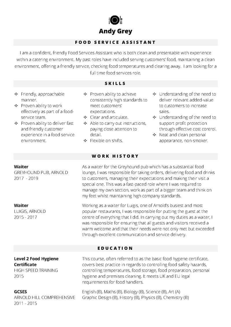
Above: This free CV template can be downloaded here.
3. Start headings and subheadings with the words carrying most information
Putting the most important information in your headings first means recruiters who are scan reading your CV can quickly find what they need.
For example, you might write ‘Contact details and availability’ rather than ‘Availability and contact details’. The former puts the most important information first.
4. Visually group small amounts of related content
This is where design elements can be really useful. Boxes, borders and shading can all help group information and reduce the ‘text heavy’ effect that so many CVs suffer from.
Here’s a good example of how information has been grouped together using line dividers:
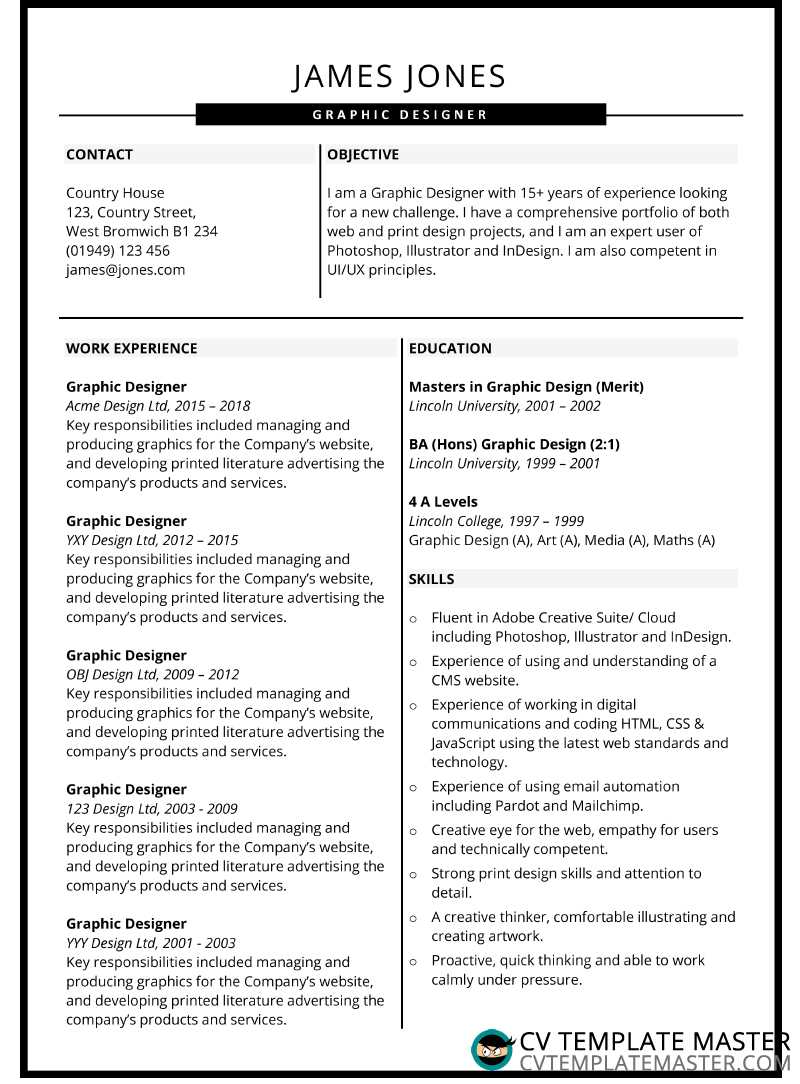
Above: This free CV template can be downloaded here.
5. Bold important words and phrases
Adding bold formatting to phrases that you really want the employer to notice can help them stand out. It also breaks up blocks of text and makes them easier to read.
6. Use bullets and numbers for items in a list or process
Bullet points again make your CV easier to navigate and reduces the ‘text heavy’ effect.
7. Cut unnecessary content
In the context of a CV, cutting unnecessary content means:
- Keeping everything relevant and to the point.
- Sticking to the convention of two pages and no more.
- Giving examples that relate to the job advert/specification.
In conclusion, by using proper formatting and design elements, you can help draw the reader’s attention to the most important information on your CV rather than allowing them to scan in the less-effective F-shape.
Very interesting – a different way to think about planning the CV, thank you.